Who-What-Wow

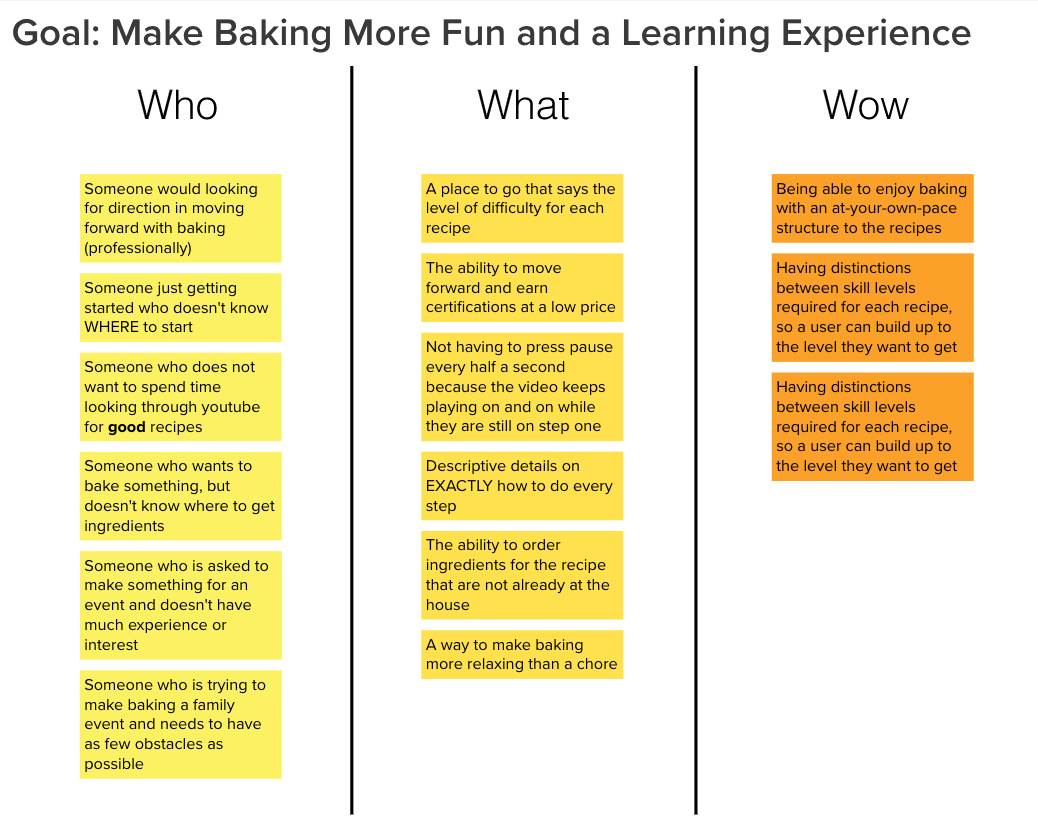
For this Case Study, I wanted to following the five step ideology as best as it fit the project: Empathize, Define, Ideate, Prototype, and Test. The picture above is a step I took to understand why I was designing a Baking Website for amateur bakers, the type of user I would be orienting my design towards, and what made the difference between my potential website and those that already exist.
Persona

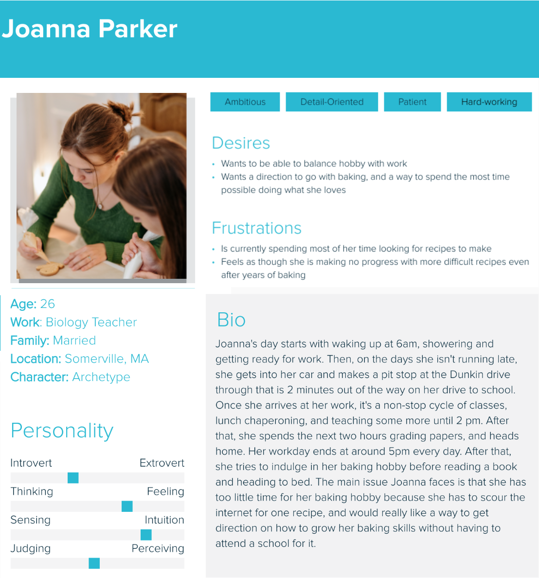
The next step I took, as my vision became a bit clearer on the purpose of the website creation, became visualizing the users I was making it for. I created a persona to put a name to potential user, take some time to think about the personality of an average working class individual, and understand the other constraints that could come to be hurdles that are stopping people from pursuing their hobbies. A big step in that was walking through what a day would look like for my hypothetical user.
Mood Board

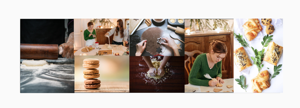
As a further step in the ideate category, and after getting a sense of the users, I created a mood board to start looking the shapes I wanted for my website, the vibe I wanted to present, the color schemes I wanted to utilize, and the emotions I wanted to depict.
High Fidelity Prototype

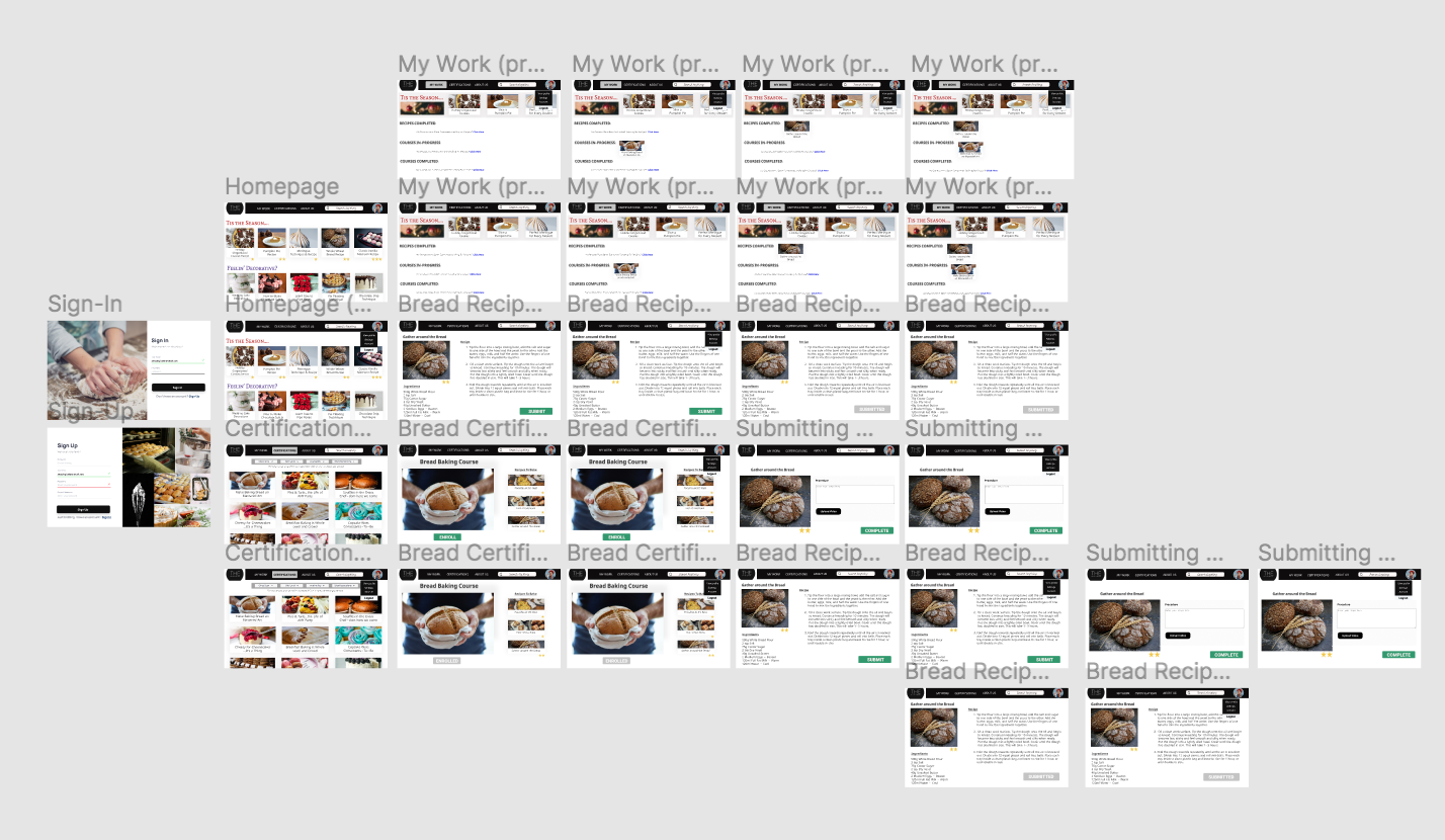
Before spending time developing a webapp, I created a high fidelity prototype in Figma to get a sense of how my application would function, and to have a piece that could be user tested on an almost full fledge level. This prototype would allow me to gauge the confusion that could appear for users when they were trying to complete specific tasks, view from a different lense the website's intimate design, and perhaps more importantly, if it was accessible.
Link to Figma Prototype


